How to Extract a Color Palette from an Image with AI

Extracting a usable colour palette from a picture is the step where most beginner projects stall: you have a reference image, screenshot, or piece of concept art, but the colours you pick by eye come out muddy, inconsistent, or unusable in a real layout. This guide walks through a repeatable pipeline — resize the source, quantise it, pull the dominant colours, clean them up, and export a swatch file you can drop into a design tool or into an indexed pixel-art sprite. It works on Windows, macOS, and Linux with any Python 3.8+ installation and a free image library; no AI subscription is required, and the same steps apply whether you are building a UI theme, a slide deck, or a 16-colour sprite sheet.
Requirements and Preparation
- **Python 3.8 or newer** — `python3 --version` should print something like `Python 3.11.6`. Lower versions may lack current library wheels.
- **Pillow** (the maintained fork of PIL, the standard Python imaging library) — install with `pip install Pillow`.
- **A source image** — JPG, PNG, or WebP. A flat illustration or a photo both work; a screenshot of a UI also works well.
- **ImageMagick (optional)** — a command-line image tool, handy if you prefer not to write code: `magick -version`.
- **A place to store output** — one text file with HEX codes is enough; a `.gpl` file if your editor reads GIMP palettes.
- **Write permission** in the folder where you run the script — otherwise the export step fails silently in some shells.
Example:create a working folder and check the two dependencies in one go:
mkdir palette && cd palette
python3 -c "import PIL; print(PIL.__version__)"
magick -version | head -n 1
If `PIL.__version__` prints `10.2.0` and ImageMagick prints `Version: ImageMagick 7.1.x`, you are ready. Why this works: both tools report their own version, so you learn about a broken install before you waste time debugging your script.
Step-by-Step Instructions
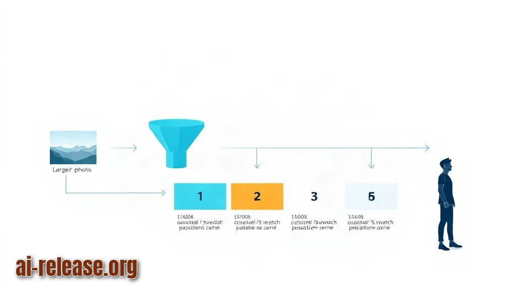
1. **Shrink the image before analysing it.** Resize so the longest side is about 512 px and save as a clean PNG. Quantisation algorithms count pixels; a 4000 px photo makes the process slow and every JPEG artefact gets a vote.
**Example:** `magick cover.jpg -resize 512x512\> -strip source.png` — `-strip` removes EXIF metadata, `\>` means "shrink only, never enlarge". Expected result: a `source.png` file of roughly 150–300 KB.
Why this works: fewer pixels means faster counting, and JPEG noise — random colour speckles around edges — is averaged away instead of polluting your palette.
2. **Decide the number of colours you actually need.** A UI theme usually wants 5–8 colours; pixel art usually wants a small fixed count, often 8 or 16, because every extra colour has to be drawn by hand. Write the number down before you extract — choosing it afterwards always leads to endless tweaking.
3. **Extract the dominant colours with a quantiser.** A quantiser groups similar pixels into a limited number of buckets. Save this as `extract_palette.py`:
# extract_palette.py — print the N most common colours in an image
import sys
from collections import Counter
from PIL import Image

def palette(path, n=6, sample=512):
    img = Image.open(path).convert("RGB")
    img.thumbnail((sample, sample))                     # speed: fewer pixels to count
    img = img.quantize(colors=n, method=Image.MEDIANCUT).convert("RGB")
    counts = Counter(img.getdata())
    total = sum(counts.values())
    return [(c, round(100 * k / total, 1)) for c, k in counts.most_common()]

if __name__ == "__main__":
    path = sys.argv[1]
    n = int(sys.argv[2]) if len(sys.argv) > 2 else 6
    for rgb, share in palette(path, n):
        print(f"#{rgb[0]:02X}{rgb[1]:02X}{rgb[2]:02X}  {share:>5.1f}%")
**Example:** `python3 extract_palette.py source.png 6` prints something like:
#1B2A41   38.4%
#F2E9DC   24.1%
#E4572E   15.6%
#7F9C7A    9.8%
#C9A227    7.2%
#2E2E2E    4.9%
Why this works: MEDIANCUT splits the colour space along the widest axis repeatedly, so it keeps colours that are visually far apart instead of averaging everything into grey mud. The percentages tell you which colour dominates — useful later when you assign background versus accent.
4. **Check the palette against the original by eye.** Open `source.png` and the hex list side by side. If a colour in the list does not exist anywhere obvious in the picture, it is an average of two neighbours, not a real colour. Lower the count by one and re-run.
**Example:** 6 colours produced two near-identical dark blues (`#1B2A41` and `#1E2C44`). Re-running with `5` merged them into one usable dark tone.
5. **Merge near-duplicates.** Compare colours by hue, not by hex text. Two colours that differ only in brightness can usually collapse into one with a lightness tweak. Keep the merged list to your target count.
6. **Export a swatch file your tools understand.** Plain HEX text works everywhere; `.gpl` is the GIMP/Inkscape/Krita palette format. A minimal `palette.gpl` looks like this:
GIMP Palette
Name: Cover Palette
Columns: 6
#
 27  42  65  #1B2A41
242 233 220  #F2E9DC
228  87  46  #E4572E
127 156 122  #7F9C7A
201 162  39  #C9A227
 46  46  46  #2E2E2E
**Example:** drop this file into Krita's `palettes` folder and the palette appears in the palette docker without a restart. Why this works: the file is plain text with RGB triplets, so any editor that reads GIMP palettes can parse it.
7. **Use the palette somewhere immediately.** Load the swatches into your design tool or slide theme so the colours get tested in context. If you are building a deck, the same discipline applies as in How to Create Presentations with AI: Best Tools and Tips — a fixed palette is what makes generated slides look like one family instead of a patchwork. If the output is a video or animation, keep the palette constant across frames, the same way colours are pinned in How to Create Videos with AI and Remotion: Automation Guide.
8. **For pixel art, quantise the image to the palette, not just the swatches.** Keeping 8–16 colours and letting the tool dither (checkerboard-blend two colours to fake a third) gives a sprite that reads correctly at 1× zoom and uses fewer unique colours in the file.
**Example:** `magick sprite.png -dither FloydSteinberg -colors 8 sprite_8col.png` — the output visibly reuses the palette instead of introducing new shades. Why this works: `-colors` forces every pixel into one of the 8 buckets; dithering hides the banding that flat quantisation creates on gradients.
Verification checklist before you ship the palette:
- [ ] The source image was resized to ≤ 512 px on the longest side.
- [ ] Every hex code in the list appears somewhere in the original picture.
- [ ] No two swatches are visually indistinguishable side by side.
- [ ] Text on your main background colour passes a contrast check (aim for roughly 4.5:1 for body text).
- [ ] The palette file opens in your target editor without errors.
Common Problems and Fixes
The palette is dominated by one boring colour, usually white or grey.
Symptom: your 6-colour list contains four near-white shades and the accents are missing. Cause: a flat background or sky occupies most of the pixels, so it wins the vote.
Fix: crop the image to the interesting region first — `magick cover.jpg -crop 60%x60%+100+100 +repage cropped.png` — then re-run `extract_palette.py` on `cropped.png`. If one tone still dominates, run the script with a higher count (say 10) and manually drop the background entries.
The output looks muddy or washed out.
Symptom: every swatch is a dusty mid-tone, nothing is saturated. Cause: too many colours were requested from a photo with gradients, so the quantiser averaged distinct hues together.
Fix: reduce the count by 2–3 and re-run. If the image is a photo of a scene, extract from a single object instead — select the region, crop it out, and analyse that crop alone.
The colours shift when you paste them into another app.
Symptom: the hex code is identical, but the colour looks different in the browser versus your editor. Cause: a colour-profile mismatch — the image carries a wide-gamut profile while your hex codes are plain sRGB.
Fix: convert the source before analysis: `magick source.png -colorspace sRGB source_srgb.png`. Then re-extract. Also check that the receiving tool is set to sRGB rather than a display-specific profile.
FAQ
How many colours should I extract from an image?
Five to eight for a UI theme or slide deck; eight to sixteen for pixel art. Start at six, look at the result, and only change the number if two swatches are indistinguishable or if accents are missing.
Can I extract a palette from a photo with smooth gradients?
Yes, but expect averaging. Photos contain thousands of intermediate shades, so the quantiser returns mid-tones rather than crisp accents. Crop to a specific object or region first, and reduce the colour count so the boundaries between buckets are clearer.
Do I need an AI service for this, or is a script enough?
A script plus a quantiser covers most cases and costs nothing. A hosted palette service is convenient when you want to try several counts quickly or share a link with a teammate, but it uses the same underlying idea: group similar pixels, then report the groups.
Can I use the same palette for pixel art and for a website?
You can, but check contrast separately for each use. A 16-colour sprite palette often contains several very dark shades that are unusable as page text colours. Keep one master list and tag each swatch with its role — background, text, accent — so you do not accidentally use a shading colour for body copy.
🤖 AI summary
- Updated: 2026-10-14
- Topics: палитра из изображения, ai color palette generator, извлечь цвета из картинки, палитра для пиксель-арта
- Summary: Пошаговый разбор ИИ-инструментов, которые вытаскивают палитру и отдельные оттенки из фото, скриншотов и спрайтов — с экспортом в HEX, ASE и ограничением до 8–16 цветов для пиксель-арта.
- Key facts:
- Extracting a usable colour palette from a picture is the step where most beginner projects stall: you have a reference image, screenshot, or piece of concept art, but the colours you pick by eye come out muddy, inconsistent, or unusable in a real layout.
- This guide walks through a repeatable pipeline — resize the source, quantise it, pull the dominant colours, clean them up, and export a swatch file you can drop into a design tool or into an indexed pixel-art sprite.
- It works on Windows, macOS, and Linux with any Python 3.8+ installation and a free image library; no AI subscription is required, and the same steps apply whether you are building a UI theme, a slide deck, or a 16-colour sprite sheet.
- Requirements and Preparation Illustration: Requirements and Preparation Python 3.8 or newer — python3 --version should print something like Python 3.11.6 .
- Lower versions may lack current library wheels.
- Pillow (the maintained fork of PIL, the standard Python imaging library) — install with pip install Pillow .